DRAG

Crust + Créme

Brand development for patisserie specialising in artisanal and fusion pasties.
Brand development
logo design
menu design
Close-up texture of a brown pie crust and smooth creamy filling with a yellow label reading 'crust + crème'.
the client and brief
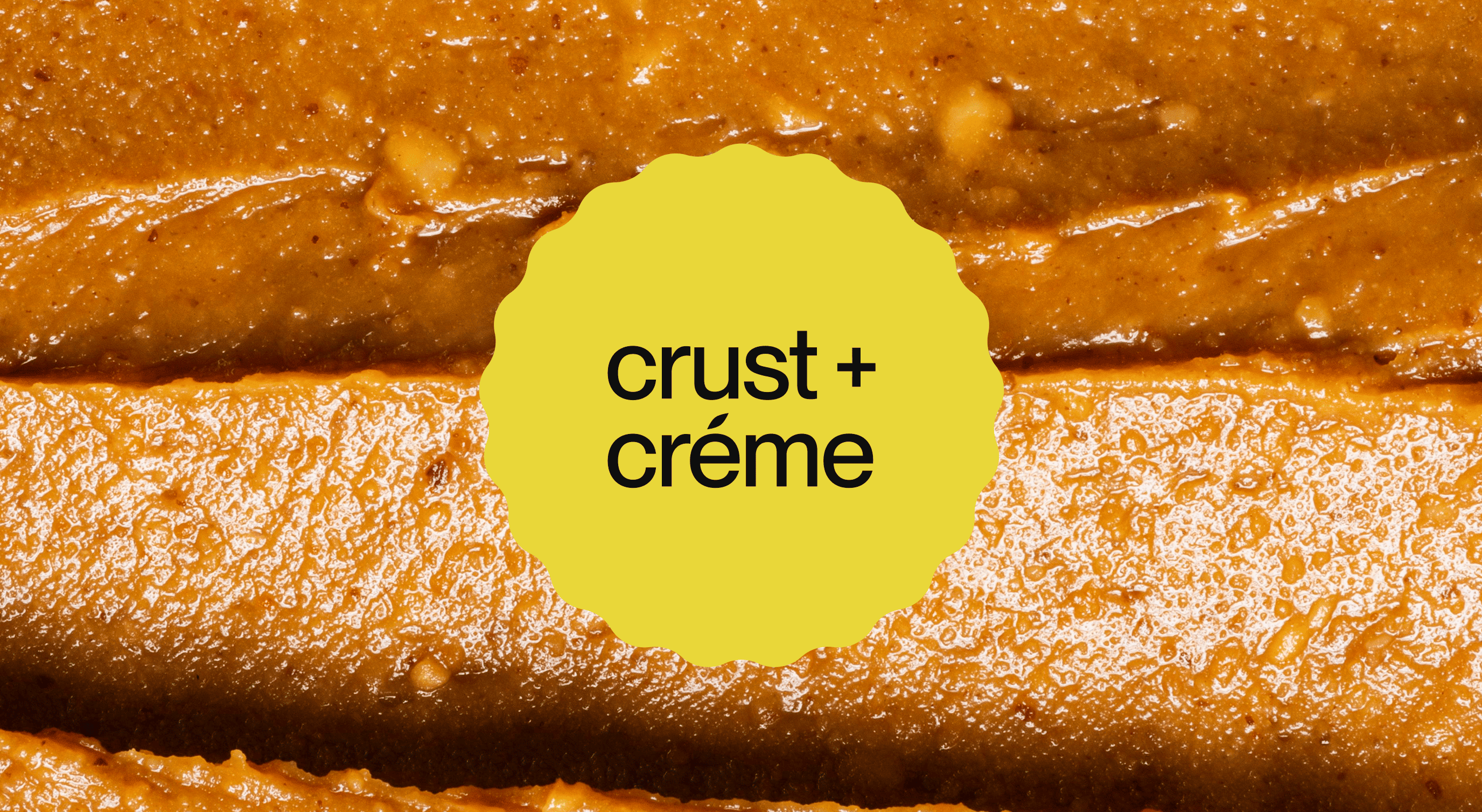
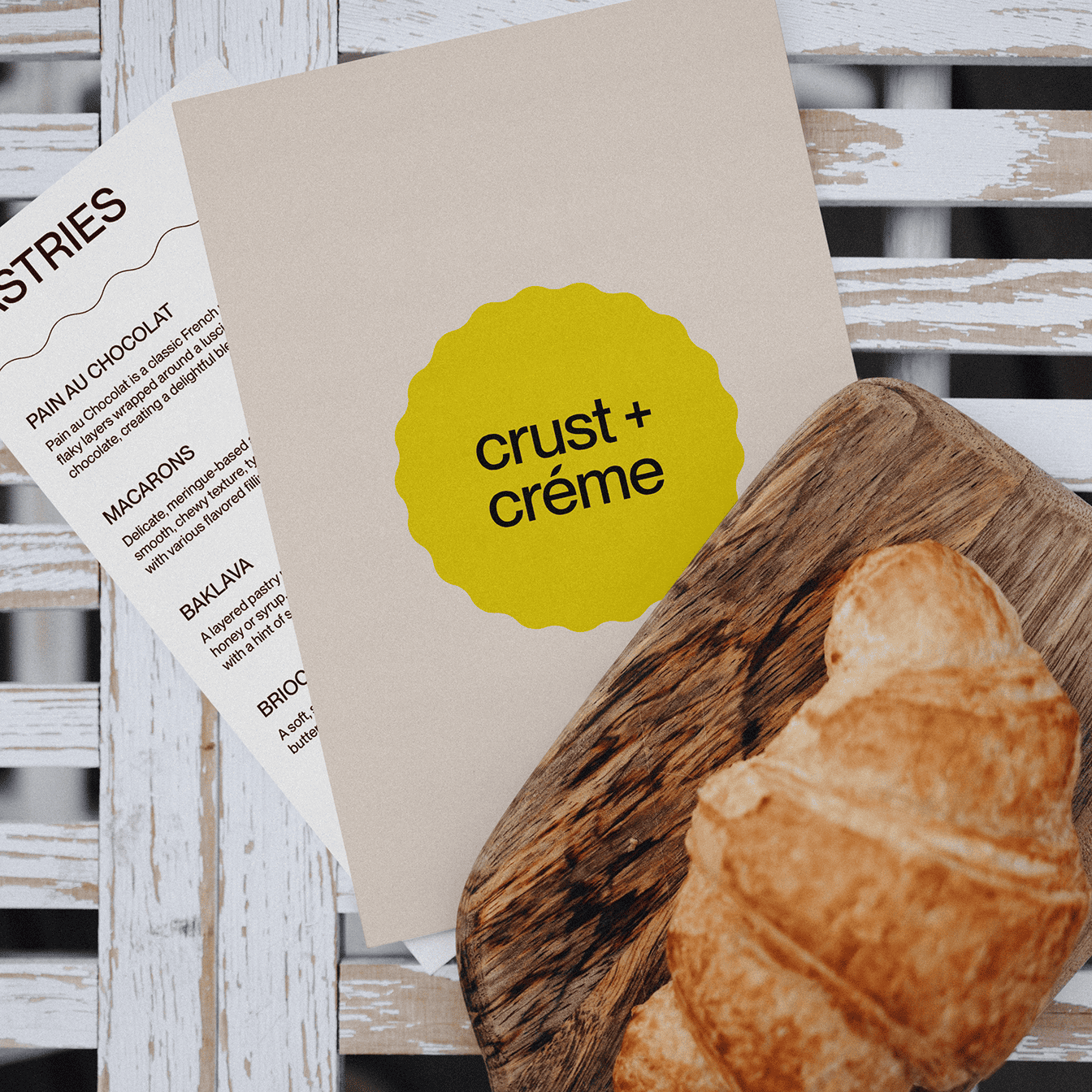
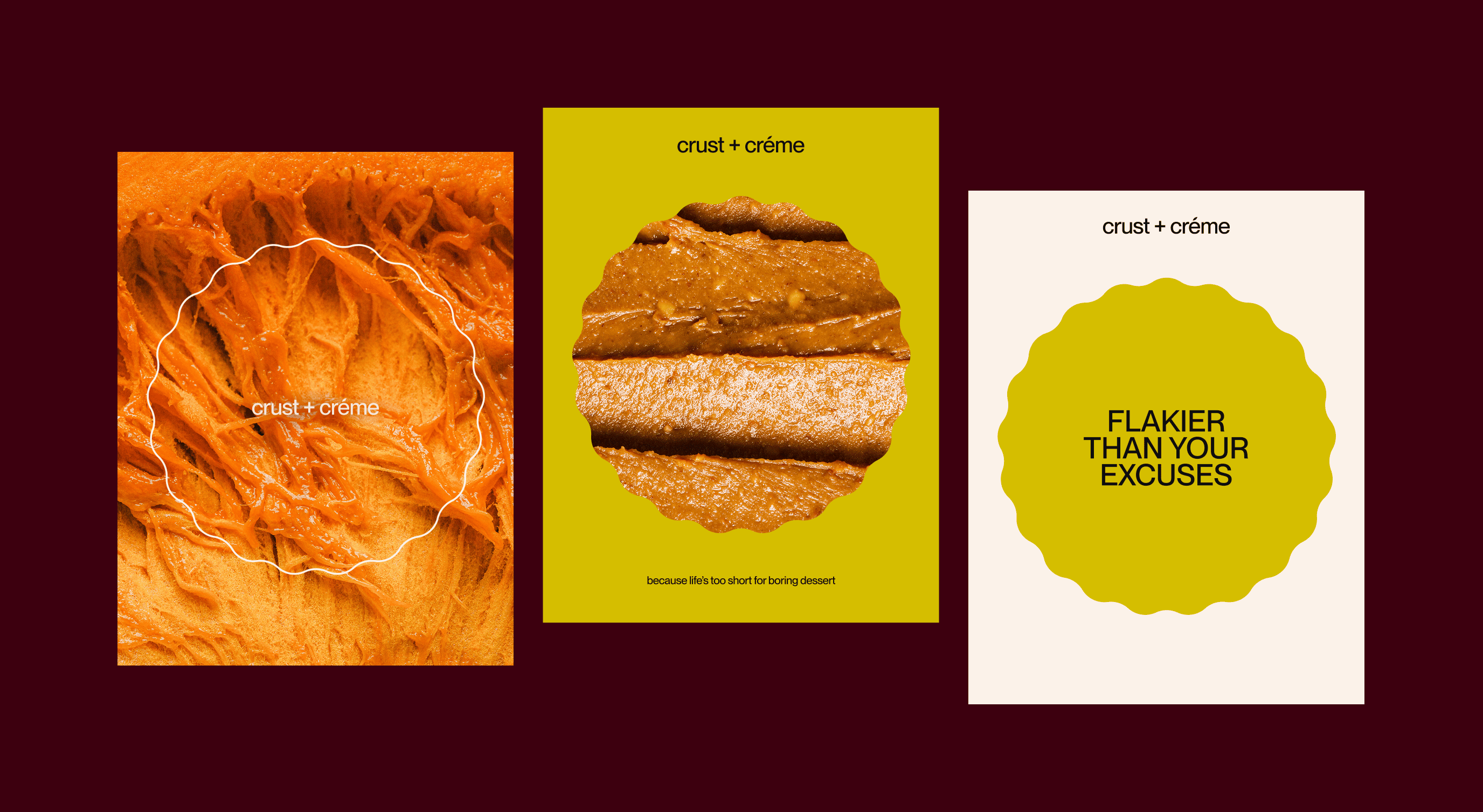
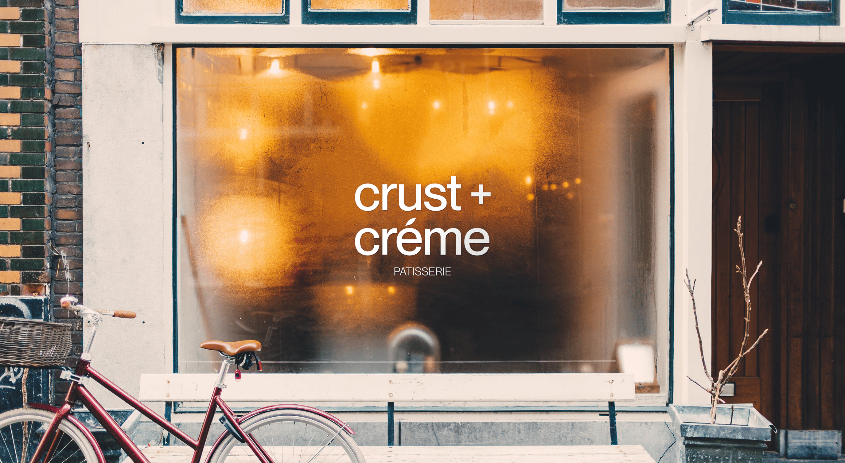
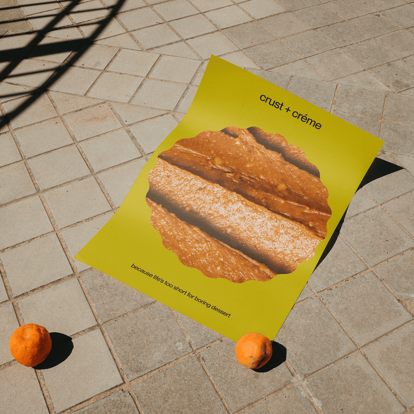
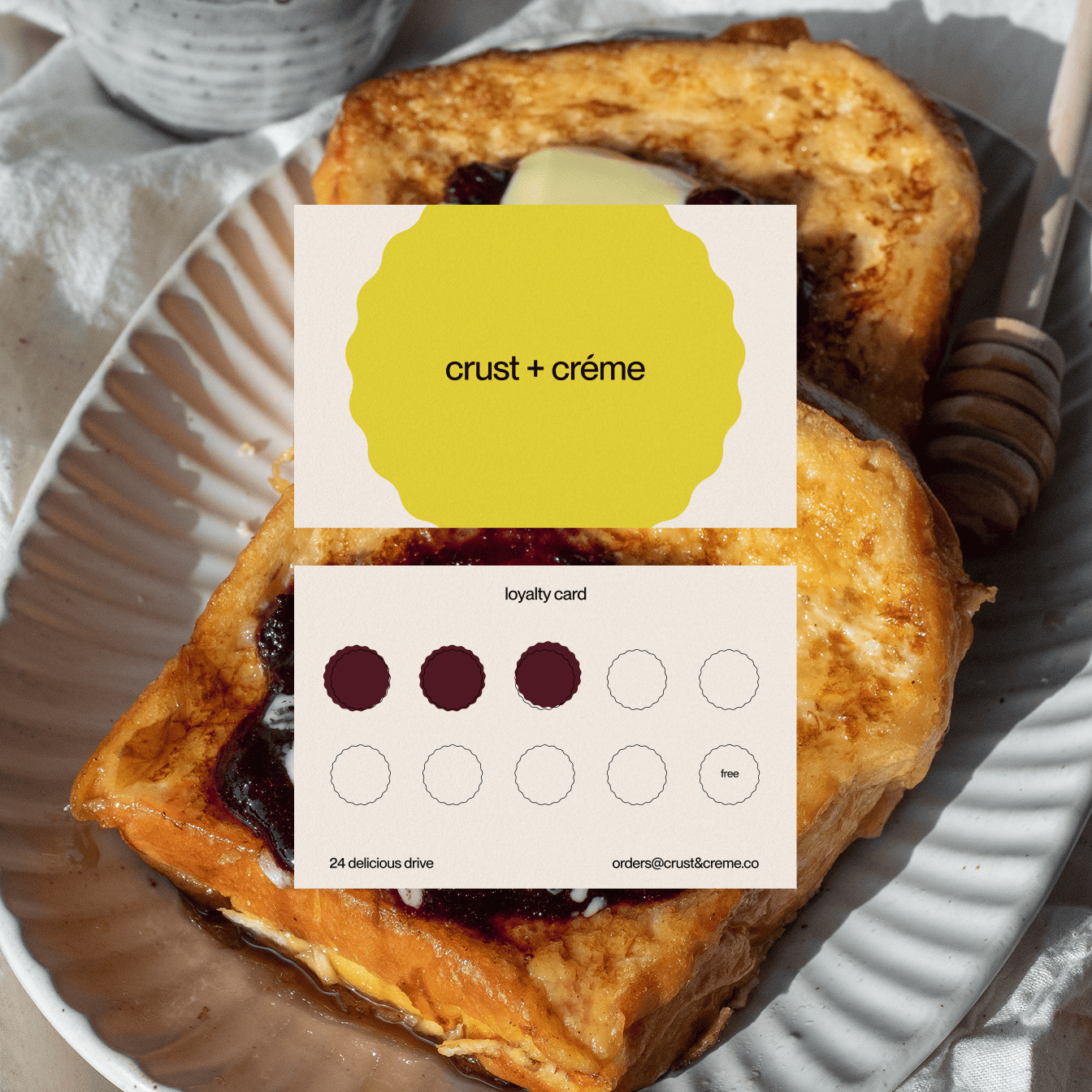
Inspired by the zesty and tangy shades of green and maroon from the fresh ingredients used in the pastries I crafted a unique and alternative brand identity that doesn’t fit the “status quo” of a traditional bakery.
Croissant on a wooden board next to a menu card with a yellow logo reading 'crust + crème' on a white rustic table.
Abstract design with three horizontal rounded rectangles in dark burgundy, cream, and yellow.
Three artistic close-up images of flaky crust and creamy filling textures with text overlays promoting crust and crème desserts.
the result
Incorporating a minimalist font with basic shapes, the branding makes room for collateral exploration with textures, flavours and styles, just like the bakery itself.
Frosted window of a patisserie with the sign 'crust + crème' and a red bicycle with a basket parked in front.
Poster on tiled ground with image of dessert crust and text reading 'crust + crème' and 'because life’s too short for boring dessert', flanked by two oranges.
Two slices of French toast on a plate with a honey dipper and a loyalty card with three stamps and text 'crust + crème'.

love     what
you're seeing?